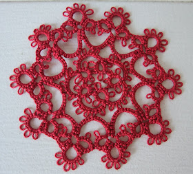
You can't really see the improvement - the picots look all crooked and bunchy. In fact, the old one on the right looks better - to me, anyway.
The first one I just posted to a friend, and I noticed as I tatted it that I had made a mistake in the pattern in the ones done before. On the picot edge, my count was wrong .
I notice that my speed and accuracy have shifted a little. I just wish the first pic looked like the real one - the improvement was obvious - I wanted to keep it!

This is Coaster #2.
I prefer the solid colours, or at least variegated colours that do not pool in great blobs like the last red and brown coaster did. This one looks so much better than the last one that I may have to replace the first with a solid colour.Critical observation creates a lot more projects!
Anon,

I agree with you about the variegated colours pooling in great blobs in your last coaster. When you hand dye you try to avoid this happening if poss...not always possible tho. I tend to like subtle colour changes for this reason.
ReplyDeleteSome designs just don't look right in varig thread...in my opinion...others come to life with it.
Nice coaster! I am not really looking real hard at the hearts to compare, but I know that I notice subtle differences in my own tatting of a same pattern.
ReplyDeleteThe coaster is very pretty! What pattern did you use?
~TattingChic ♥
TattingChic,
ReplyDelete"This motif is "Round Paperweight Motif" from Projects in Tatting by Sheila York, and the pattern is on page 54.c, "
... lifted from Diane's blog and used by me! I ordered the book to get this pattern because Diane said it was a good one. It is. I love this little motif and the coasters are looking good! Thanks for the visit! : ) Fox xxoox
Tatskool, At least it wasn't HDT!!! It was Lisbeth, which is sometimes good and sometimes not so good: twists, separates and pools. Sometimes it feels weird as well. Inconsistent.
That is why I love the hand-dyed thread. More reliable. Always feels wonderful.
: )) Fox
Hi Fox!
ReplyDeleteBoth of the hearts are pretty and well done, but when I zoom in I can see subtle differences. I noticed how neatly the joining points between chains and rings are in the left heart. It really is wonderful to have all of your progress documented here on your blog! I imagine seeing how far you have come can have the effect of spurring you forward...
I do like your coaster in the solid color. I am better able to enjoy the pattern. It really is LOVELY! What color background will the coasters have or are they clear all through?
:) Ann
Hi Fox,
ReplyDeleteI think that the fact that the picots are crooked and bunchy depend on the tread you are using, not on your skills.
That is what happened to me, at least.
Bye
I just love this pattern and would like to make a few coasters using it. Can I ask where you purchased the book from? It's very difficult to get it here in Australia and I may have to order it from overseas.
ReplyDeleteHi Arty Lady,
ReplyDeleteI loved the pattern too, when I saw it , so I ordered the book. It was second hand from a book seller in England. I found it through Amazon first and followed the links. Good luck. It is out of print, I think, so there are not a lot of inexpensive copies around. You have to really look.
: ) Fox